1/14
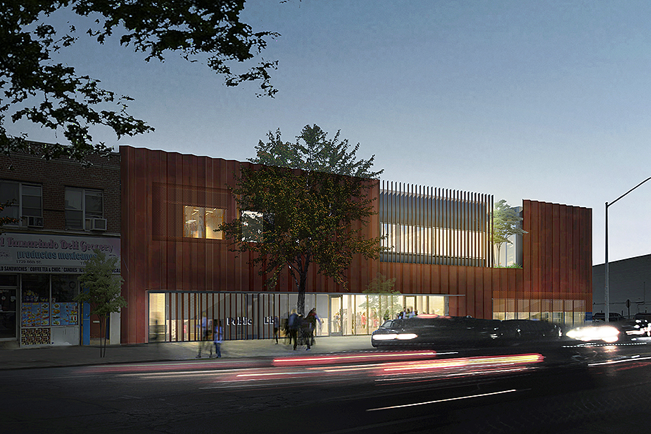
View from west across 86th Street. The new facade features a range of opening types to modulate light and view. The varied facade provides a warm, welcoming presence at street level visually enhancing connections to the community. ©2019 Rice+Lipka Architects
2/14
Street view from the south. The existing facade, compromised by decades of water infiltration, is replaced and protected by a large pleated rainscreen. The patina of the new metal screen keys off the warm masonry hues of the surrounding urban fabric. ©2019 Rice+Lipka Architects
3/14
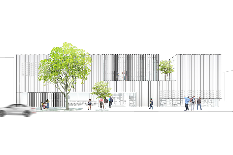
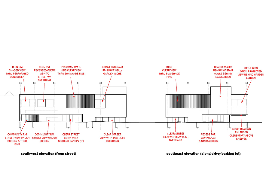
Southwest exterior elevation. A range of daylight controls are incorporated in the openings of the pleated metal rainscreen. Varied louvers, openings, perforations and opening sizes are calibrated to provide specific light qualities matched to the uses within. ©2019 Rice+Lipka Architects
4/14
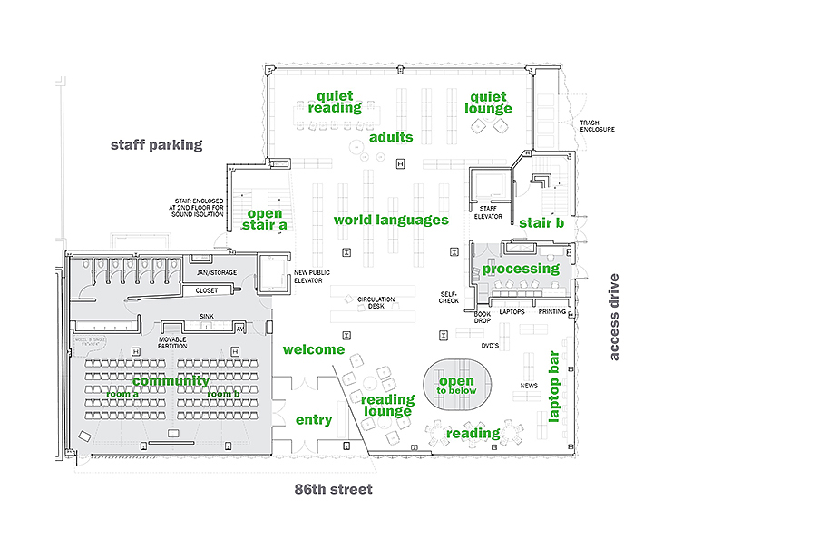
Street floor plan. Working within the existing building footprint, a new double community room is pushed to the front street facade, functioning as an extension of the sidewalk. A deep, glazed vestibule provides after-hours access and moderates interior temperatures. A new elevator provides a speedier, accessible route to all levels and a new, centralized open stair offers greater visibility and broader welcome to children and teen areas on the second floor. ©2019 Rice+Lipka Architects
5/14
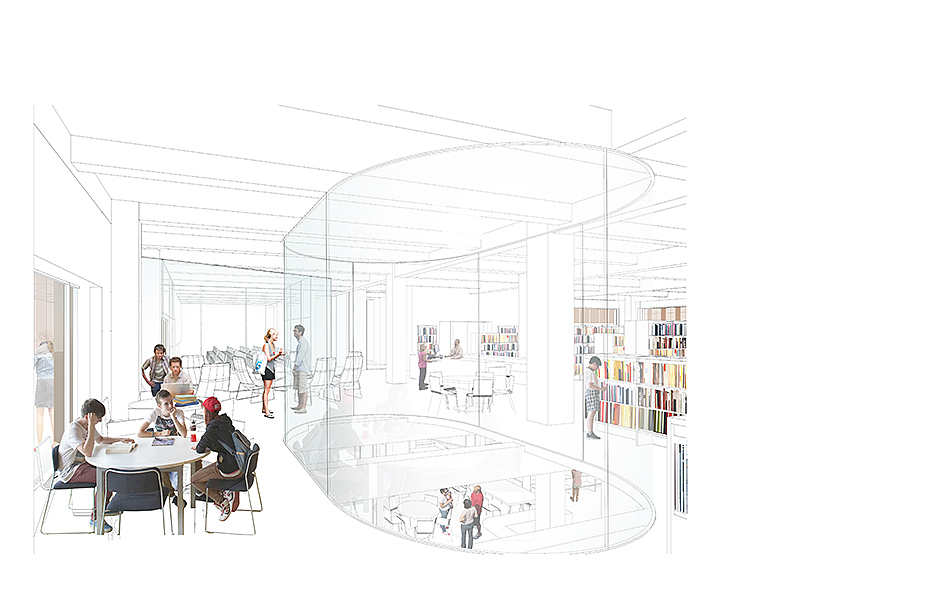
Street level from south. A reading lounge, study tables and laptop bar line the glazed perimeter maximizing visual connections with the neighborhood. An opening is cut between floors to allow light and views to the lower level.
©2019 Rice+Lipka Architects
6/14
Partial building section looking north. An open stair and floor cut allow visual access and light to the previously siloed lower level. ©2019 Rice+Lipka Architects
7/14
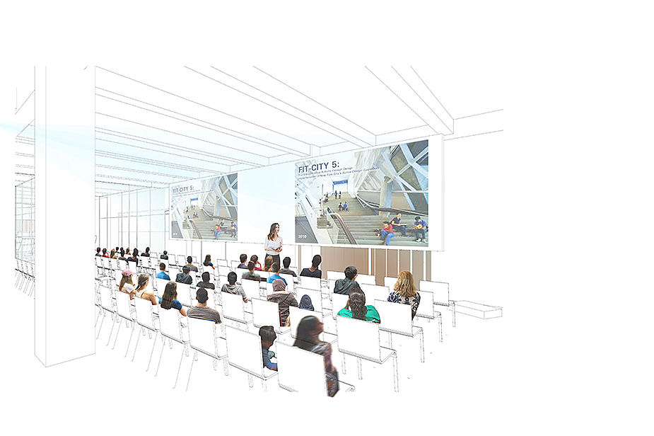
Community room looking south. The space's reciprocol view of the sidewalk and street engages the community and encourages use. Movable partitions allows the space to be divided into two smaller meeting rooms, both with after-hours access for a range of neighborhood functions. ©2019 Rice+Lipka Architects
8/14
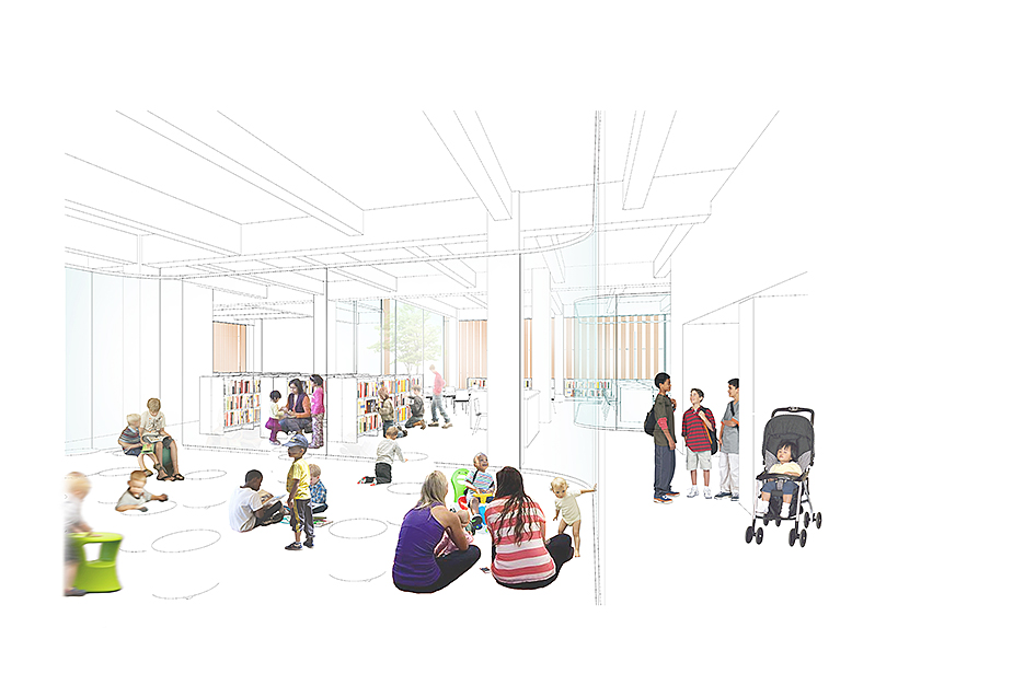
Second level floor plan. Two glazed program rooms organize and define areas for small children, older children and teens while maintaining open views across the second floor. A modest exterior garden niche along the street facade penetrates into the children's reading and computing areas bringing light and a slice of urban nature to these areas. Another small exterior garden infills an existing notched east building corner bringing varied plantings and light to the toddlers' area. ©2019 Rice+Lipka Architects
9/14
Overview of the second level looking south from program room. Children ages 6 -12 are situated beyond in an area defined by louvered exterior glazing and a garden niche. ©2019 Rice+Lipka Architects
10/14
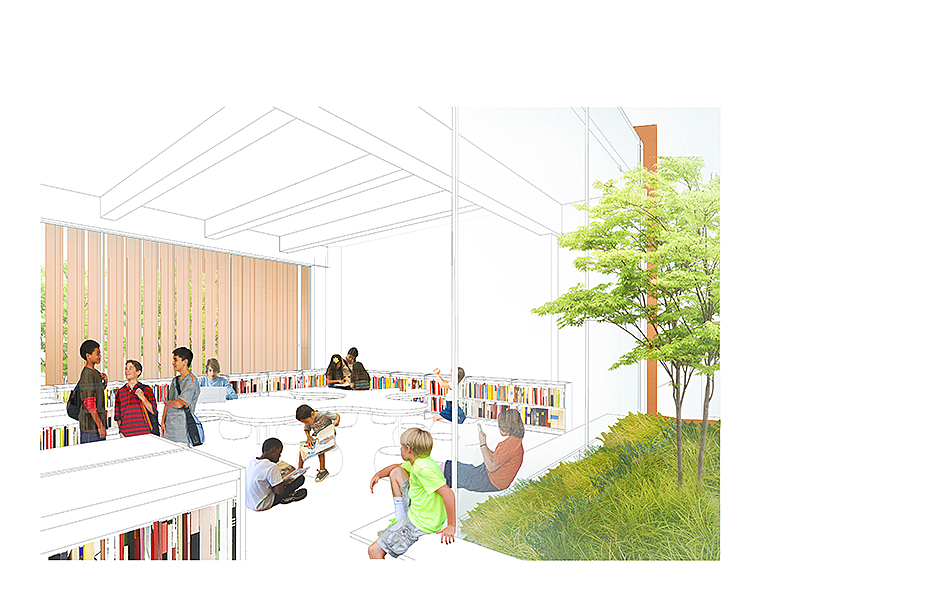
Second level childrens reading area. This reading area for children ages 6 - 12 is framed on the south by a glazed wall with louvers that provide direct daylight shading while allowing views out. On the north, a modest exterior garden niche is introduced at the street facade allowing planting and light to penentrate into space. ©2019 Rice+Lipka Architects
11/14
Second level young childrens area. Situated in the building's northeast section, exterior windows are screened with perforated sections of the pleated facade. On the east, a new exterior garden provides light and a bit of nature adjacent to the toddler area. ©2019 Rice+Lipka Architects
12/14
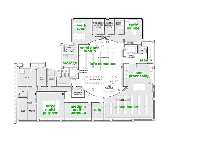
Lower level floor plan. A range of meeting spaces and offices are organized around a central, glazed Info Commons along with enhanced adult and senior support services. A new semi-open stair, along with an opening cut in the ceiling, strengthens visual connections to the street level above. ©2019 Rice+Lipka Architects
13/14
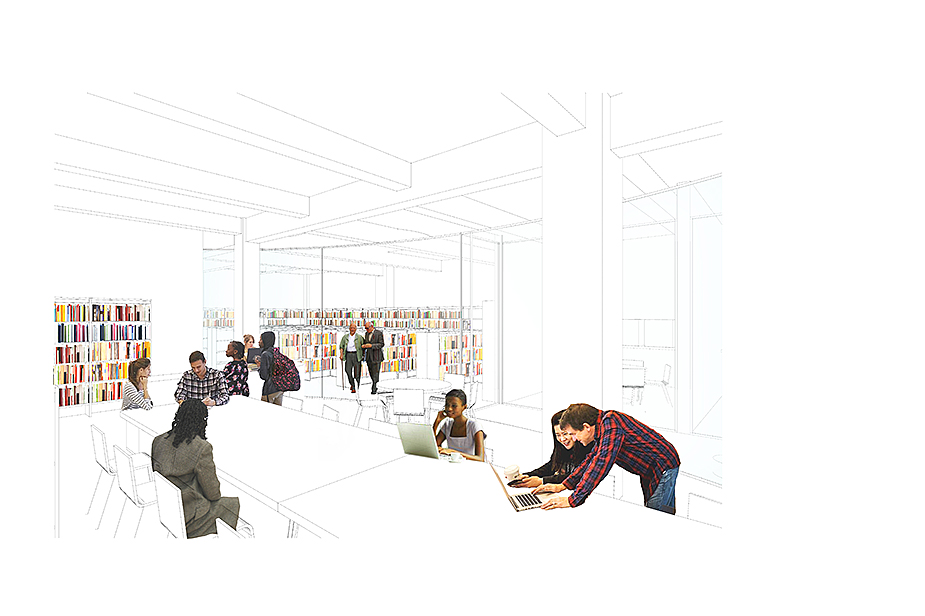
Lower level adult reading area. A range of meeting spaces and offices are organized around a central, glazed Info Commons. ©2019 Rice+Lipka Architects
14/14
Two primary exterior elevation diagrams. The existing facade, compromised by decades of water infiltration, is replaced and protected by a large pleated rainscreen. A range of daylight controls are incorporated in the openings of the pleated metal rainscreen. Varied louvers, openings, perforations and opening sizes are calibrated to provide specific light qualities matched to the uses within. ©2019 Rice+Lipka Architects

URBAN LIBRARY

Confidential, New Utrecht neighborhood, Brooklyn, NY

Proposal 2018
Proposal Completed 2018-19

This feasibility, programming, budgeting, and schematic design proposal for the full renovation of an existing 1956 modernist library building centered around input from the community. The project responds to library users and staff desires for greater, more welcoming connectivity to the street and neighborhood, for community meeting spaces that are available after hours, for dedicated children's floor, for a new Info Commons and refreshed adult/senior support services and for increased daylight deep throughout the library.

The existing building envelope, compromised by decades of water infiltration, required replacement, and is here protected by a new, large, pleated metal rainscreen. The varied facade provides a warm, welcoming presence at street level visually enhancing connections to the community. The patina of the screen keys off the warm masonry hues of the surrounding urban fabric and features a range of opening types to modulate light and view utilizing a range of daylight controls to control solar gain. Varied louvers, perforations, opening configurations and sizes are calibrated to provide specific light qualities matched to the library uses within.

Working within the existing building footprint, a new double community room is pushed to the front street facade, functioning as an extension of the sidewalk. A deep, glazed vestibule provides after-hours access and moderates interior temperatures. A new elevator provides a speedier, accessible route to all levels and a new, centralized open stair offers greater visibility and broader welcome to children and teen areas on the second floor.

Two glazed program rooms organize and define areas for small children, older children and teens while maintaining open views across the second floor. A modest exterior garden niche along the street facade penetrates into the children's reading and computing areas bringing light and a slice of urban nature to these areas. Another small exterior garden infills an existing notched east building corner bringing varied plantings and light to the toddlers' area.

At the lower level, a range of meeting spaces and offices are organized around a central, glazed Info Commons along with enhanced adult and senior support services. A new semi-open stair, along with an opening cut in the ceiling, strengthens visual connections to the street level above.

Rice+Lipka Architects
Principals: Lyn Rice & Astrid Lipka
Associate Principal: David Prendergast
Senior Associates: Taylor McNally-Anderson, Hanson Liu
Project Architect: Joe Malboeuf
Senior Designers: Ahmad Khan
Project Team: Su Yeon Chi, Michael Choi, Yiyao Liu, Mao Yu

Community Engagement: Karp Strategies
Artist Collaborator Patrick Jacobs
Geotech/Site Civil: Langan
Structural: Silman
Environmental: Plus Group
Envelope: James Gainfort Consulting Architects
Landscape: Terrain
Acoustics, Audiovisual, Technology, & Security: Cerami